Breweries
Hood’s Up Brewery
The Story
Hood’s Up Brewery is a celebration of classic Americana, inspired by the chrome, curves, and charisma of 1950s car culture. The beer market is crowded, and Hood's Up breaks through the noise by building a brand around a specific compelling theme and inventive recipes that break from the expected, satisfying the cravings of those who seek originality.
Who's it For?
Hood’s Up Brewery is for the rebels of the craft beer world, the curious, the creators, and the ones who crave something different. It speaks to those who seek bold flavors and inventive recipes that break from the expected.
The Problem it Solves
For craft beer drinkers, the modern beer scene, despite its variety, often feels saturated with conventional options. Providing a beer for the enthusiast who yearns for a brand that speaks to their unique sense of individuality. The brand's focus on classic Americana gives customers a product that evokes a sense of authentic craftsmanship that is often missing from consumer culture.
New West Artisan Ales
The Story
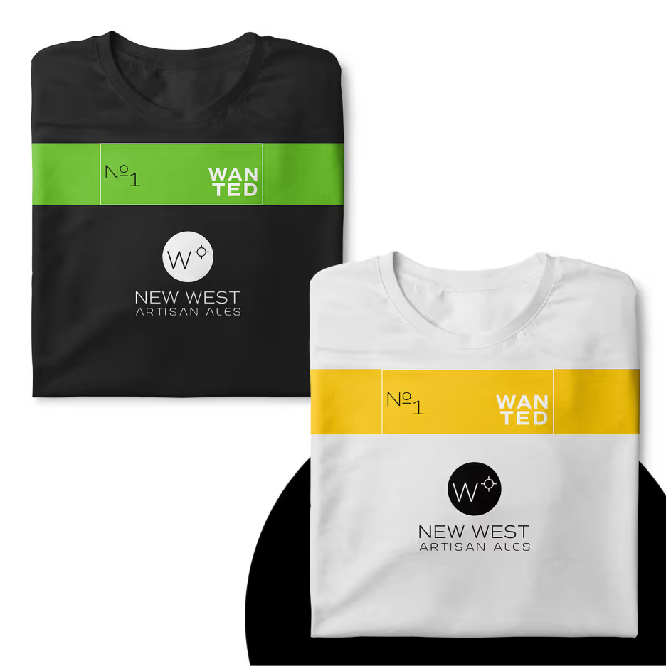
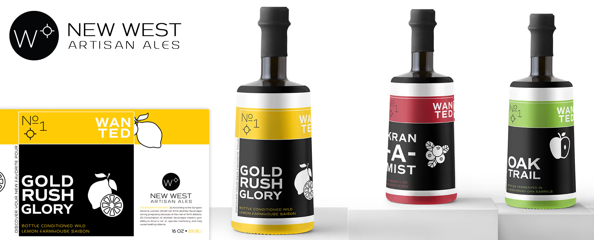
New West Artisan Ales reimagines the West not as a place of dust and duels, but as a frontier of creativity. The compass-inspired logo symbolizes discovery, as New West focuses on rustic farmhouse-style beers, known for their wild and sour approach with long aging times.
Who's it For?
For the sophisticated beer lover, many options on the market, from macro-beers to some craft brews, lack the depth, character, and artistry they desire. The problem isn't just about a limited selection; it's about a deeper frustration with a lack of craftsmanship and an overly-familiar approach to brewing. The typical beer-buying experience has become a routine transaction, rather than an act of discovery.
The Problem it Solves
New West Artisan Ales solves the problem for beer enthusiasts who feel that modern mass-produced beer lacks craftsmanship, creativity, and complexity. By focusing exclusively on wild, sour, and long-aged farmhouse ales, it offers a deliberate contrast to standard options. It is crafted for those who prize quality, time, and artistry. For the explorers seeking their next great pour, New West provides a more meaningful experience on the taste and art of fermentation.


